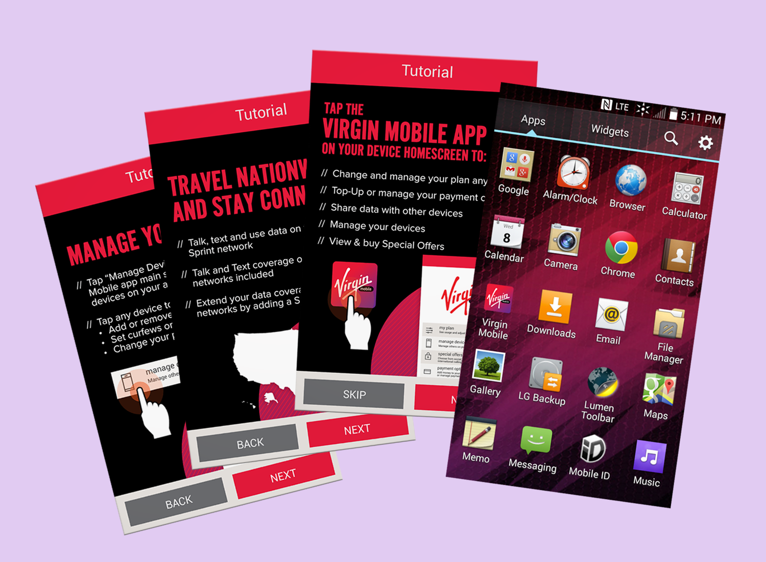
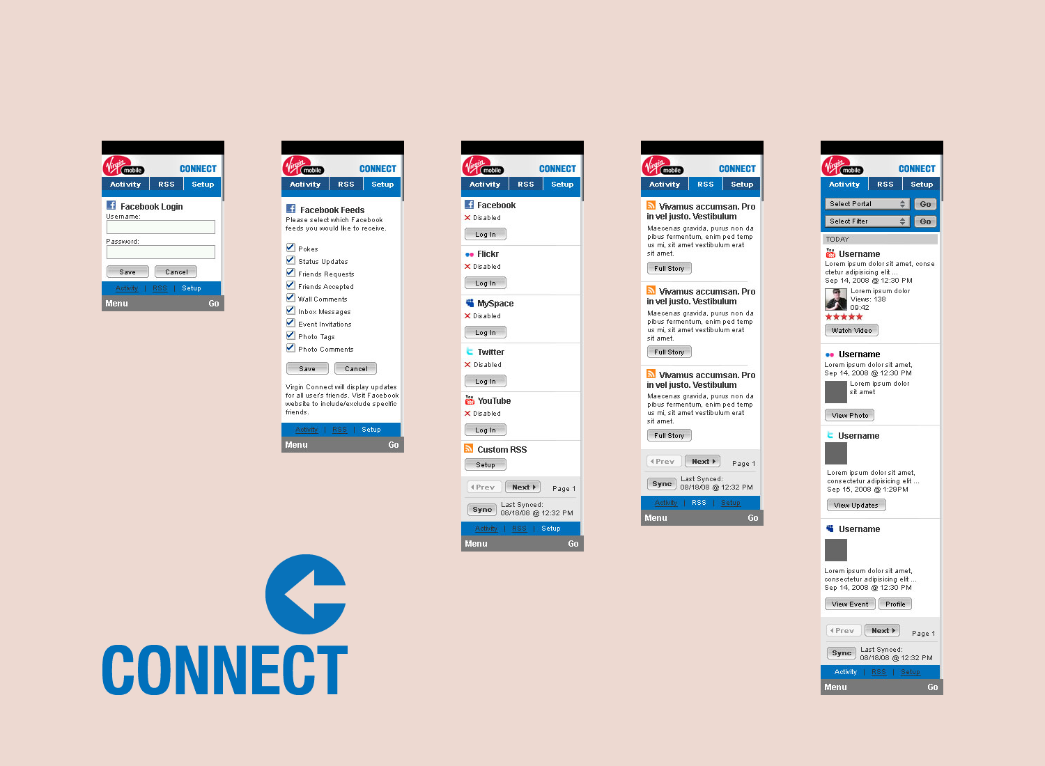
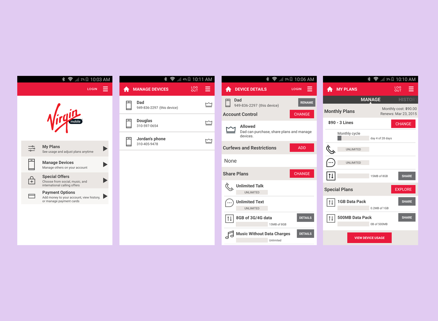
In ultimate self-service fashion, this mobile app enabled customers to, off the shelf, activate and then provision their Android smartphones. Customers were given the ability to manage their accounts and data plans. They can pay their bills, purchase add-ons, share and manage data between devices conveniently on their phone.
PLATFORM
Android, iOS (control app)
DESIGN CHALLENGE
• Evaluate existing user experience on a partner's mobile app.
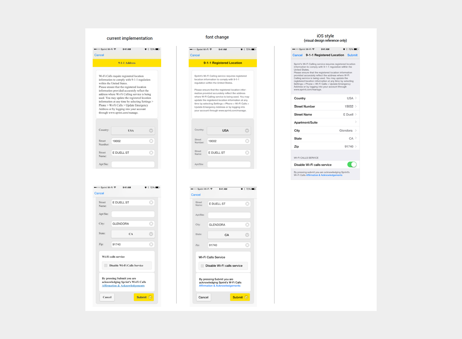
• Assess general visual design direction and make appropriate recommendations.
APPROACH + SOLUTION
• The app was in mid-development with a firm launch date when I joined the project. It was essential to work closely with the project manager not only to understand the scope of the role but also to identify where the issues are occuring in the development process beyond the typical design needs such project may need.
• Met with the brand and marketing managers to gain their product vision and get a perspective of the campaign. At this point, I was well-versed on the Virgin Mobile brand but not specifically for this service. Collected all branded image assets already developed and to build upon them.
• Met with developers onsite to understand the platform capabilities and/or limitations as well as the level of effort required on any frontend user interface implementations.
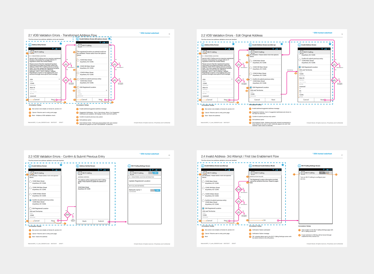
• For initial launch, a practical visual design direction was proposed based on actual technical feasibilities and realistic development time require considering available time and resources.
• Prioritized a list of UI issues found to help the team strategize product iterations.
MY ROLE
• Set visual design guidelines. Rebrand app and produce graphic assets.
• Brought interaction patterns up to date where it's technically possible and improve general user experience.
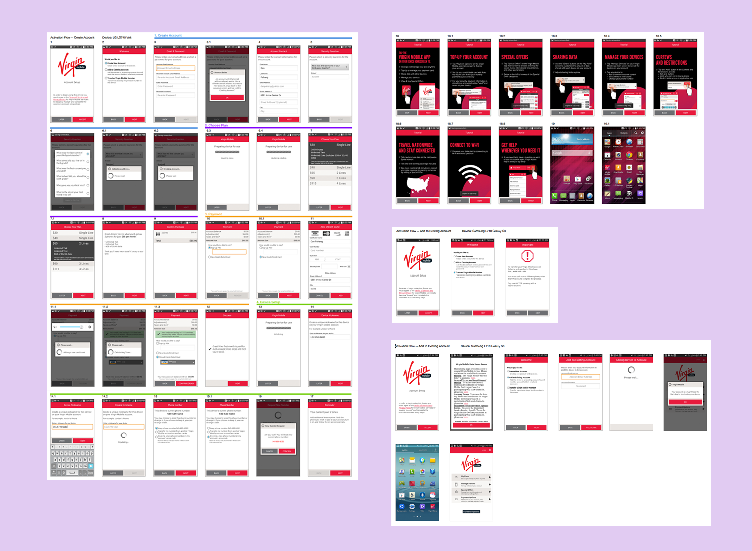
• Collaborated with subject matter experts on the activation and purchase flow.
NOTABLE RESULTS
• App launched on schedule despite limited time and resources.
• Improved error handling and flow reduced customer support calls and device return rate.

